Branding, Packaging
Programs used: InDesign, Illustrator, Photoshop
Concept Rationale: An Ontario based craft beer brand with playful and friendly aesthetic utilizing a "retro revival" color palette and whimsical line-drawn illustrations that suggest an approachable craft beer experience.
Bon Chance Brewing Co. draws inspiration from the vibrant tapestry of traditional market towns and the lush, rolling hillsides of pastoral landscapes. Embracing a spectrum of artisan pastels, each can's design is a window into the brewery's philosophy: crafting beer is an art, meant to be as visually engaging as it is palate-pleasing. This brand speaks to the modern beer aficionado—those who appreciate the subtleties of a well-brewed batch as much as a finely composed piece of art.
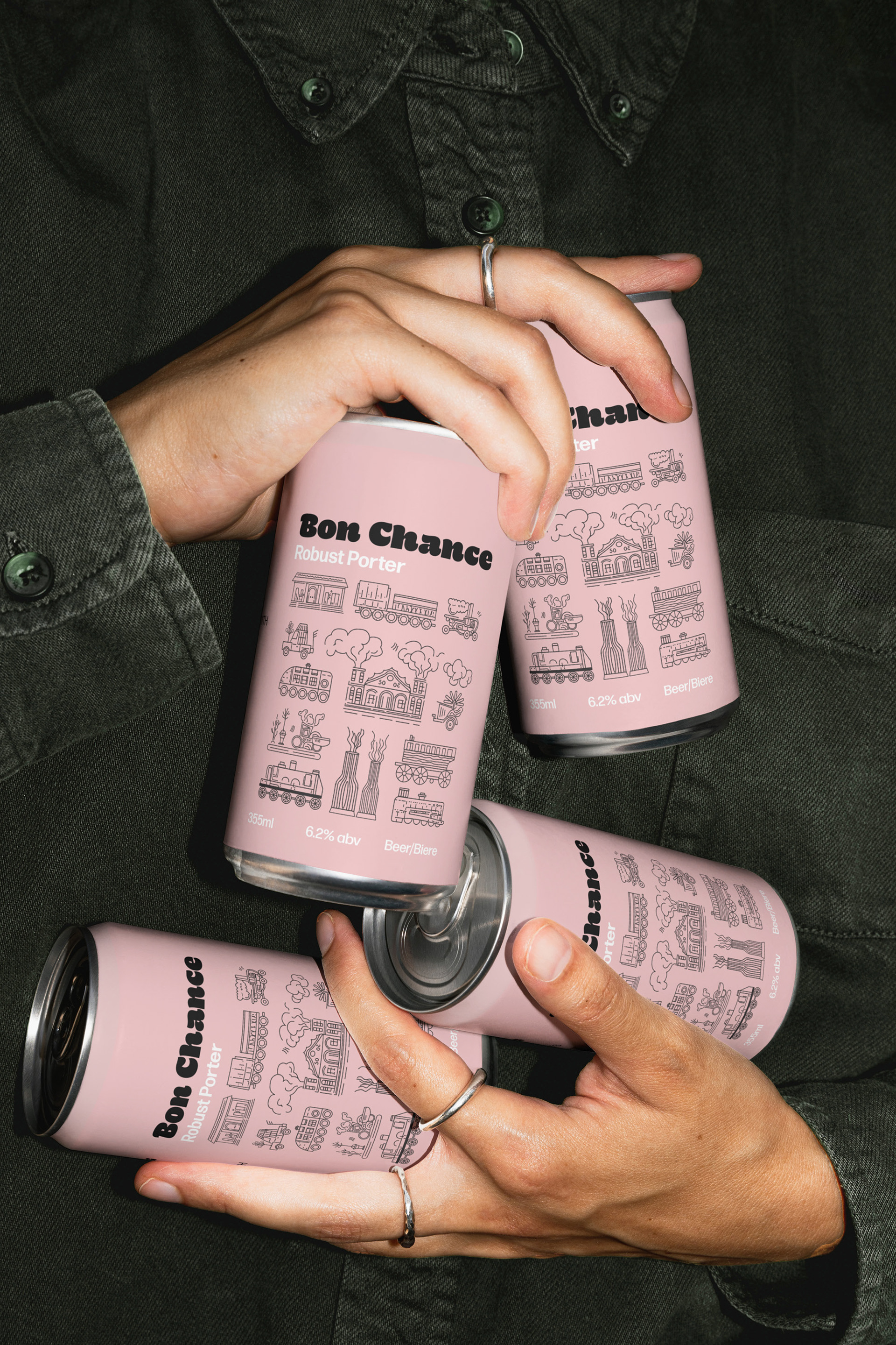
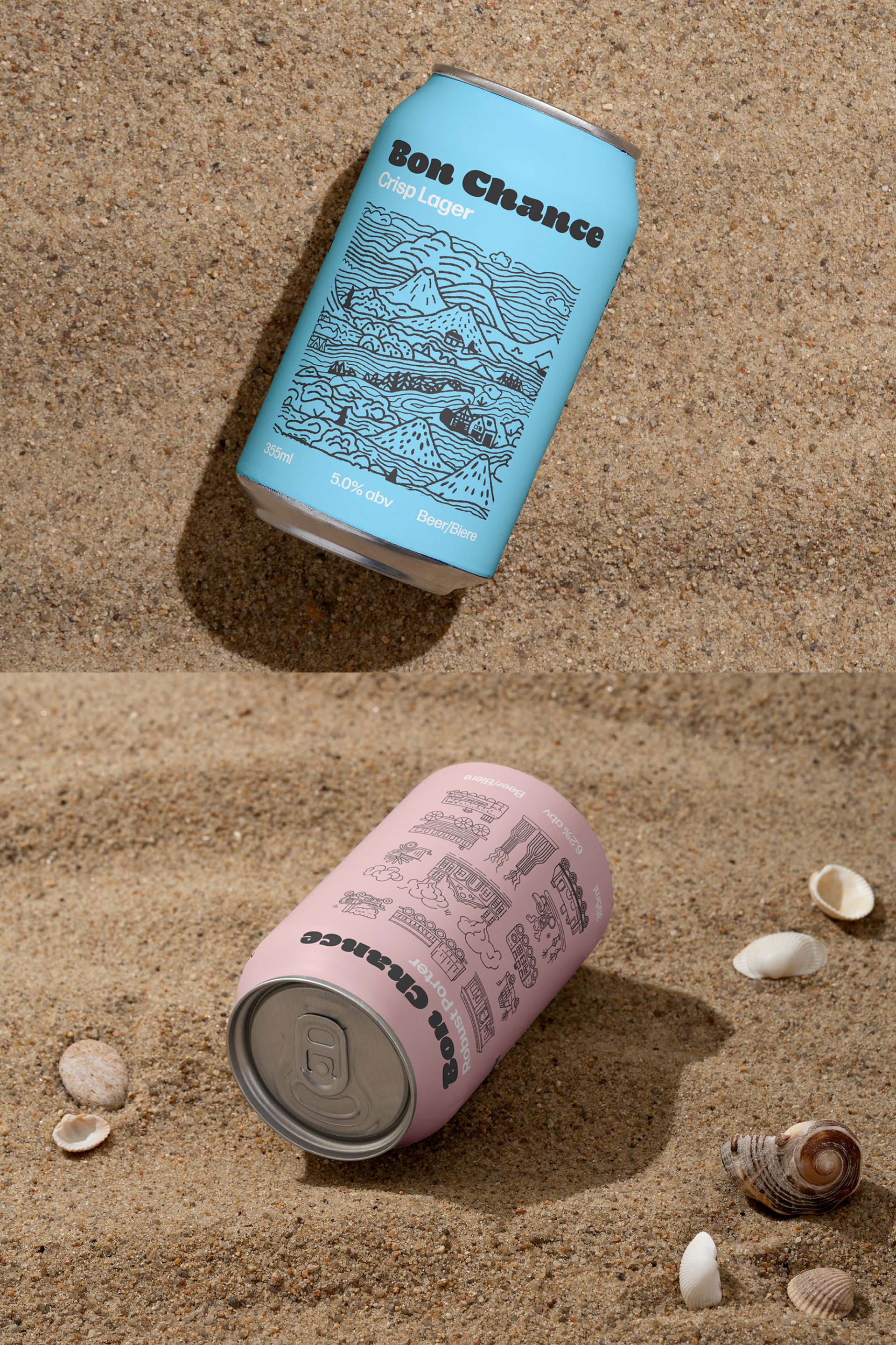
The art direction for the imagery captures a casual yet sophisticated lifestyle, with an emphasis on tactile experiences. The images should use textures – fabric and sand – to ground the product in real-life scenarios, while maintaining a focus on the unique color and detailed illustrations of the cans.
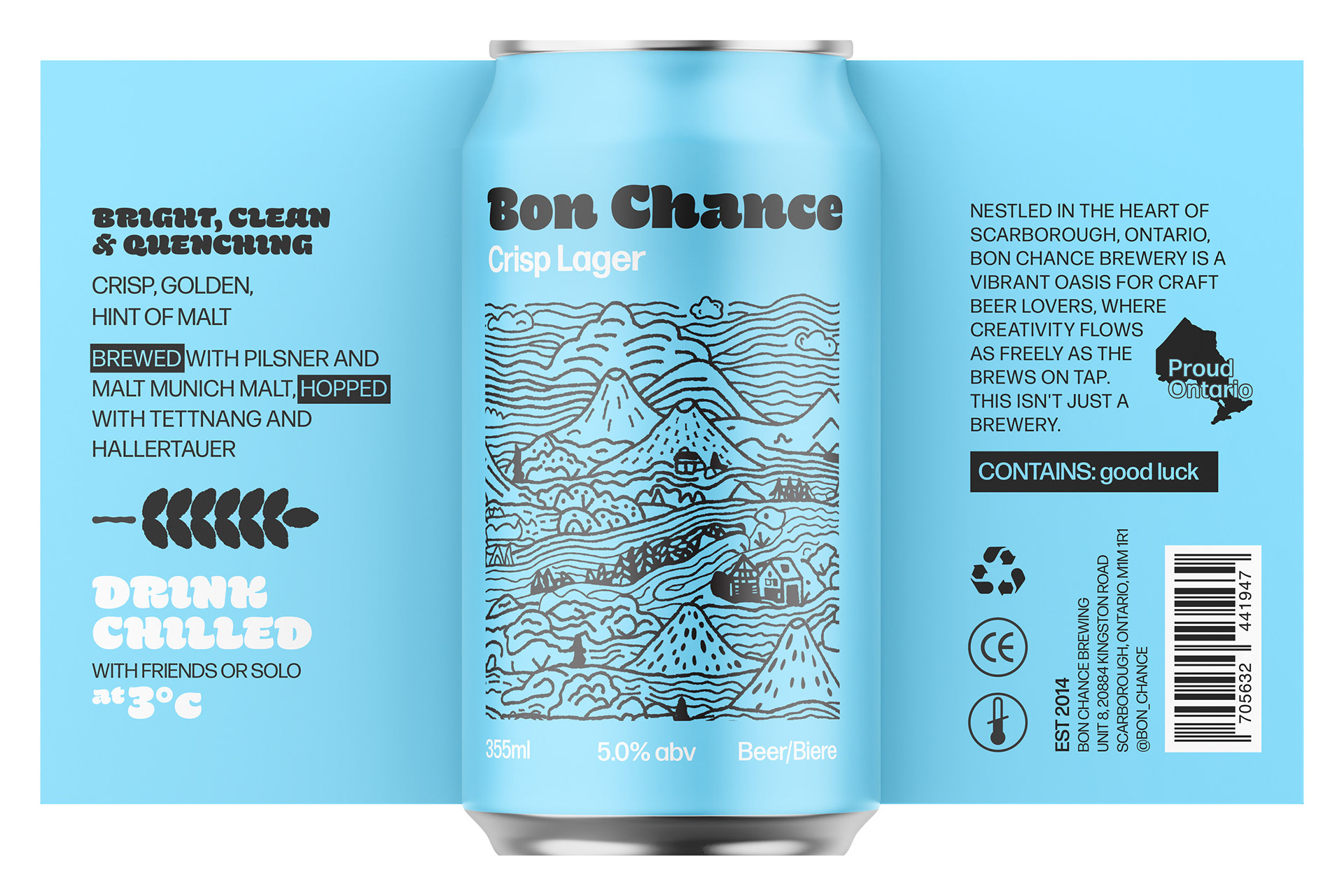
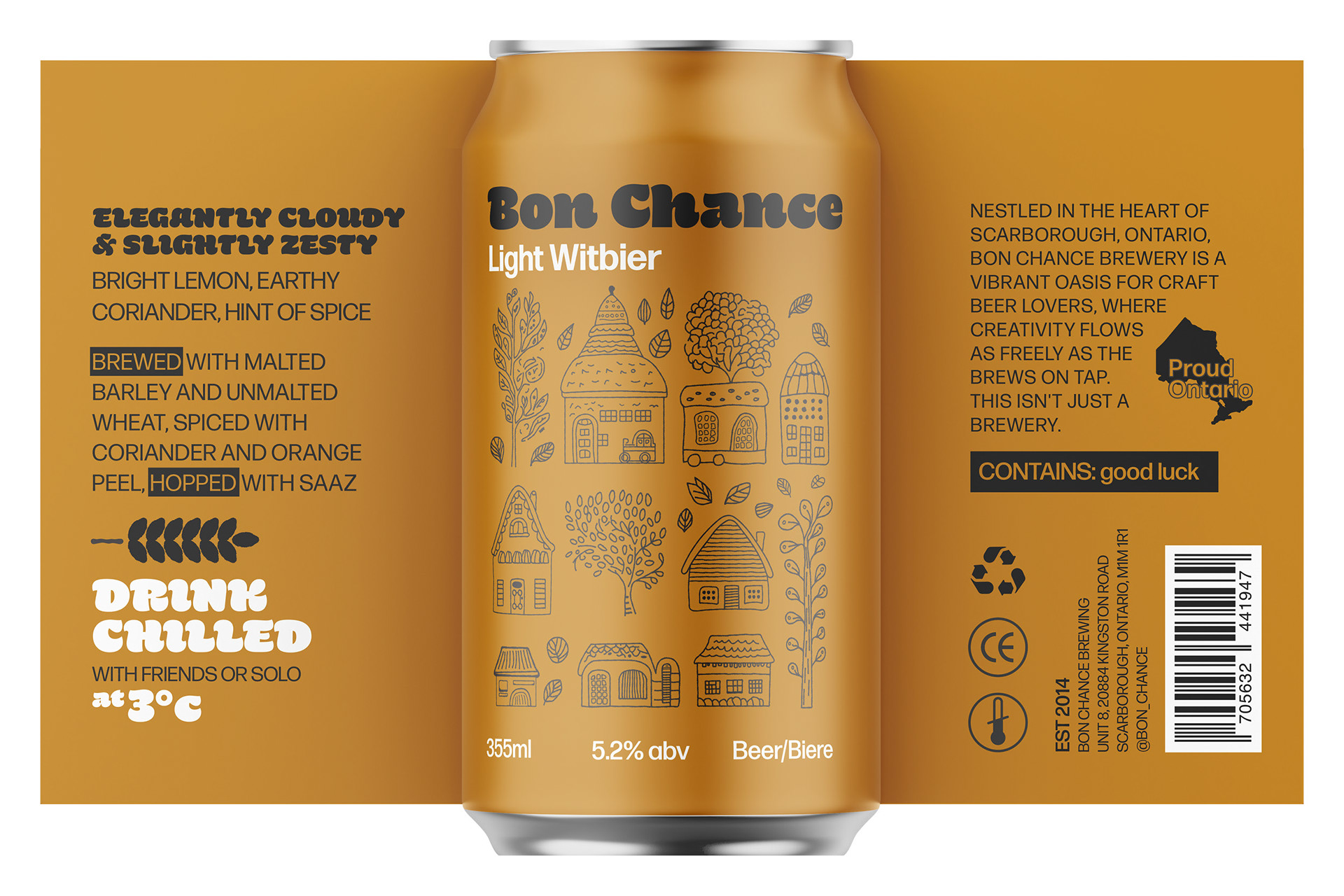
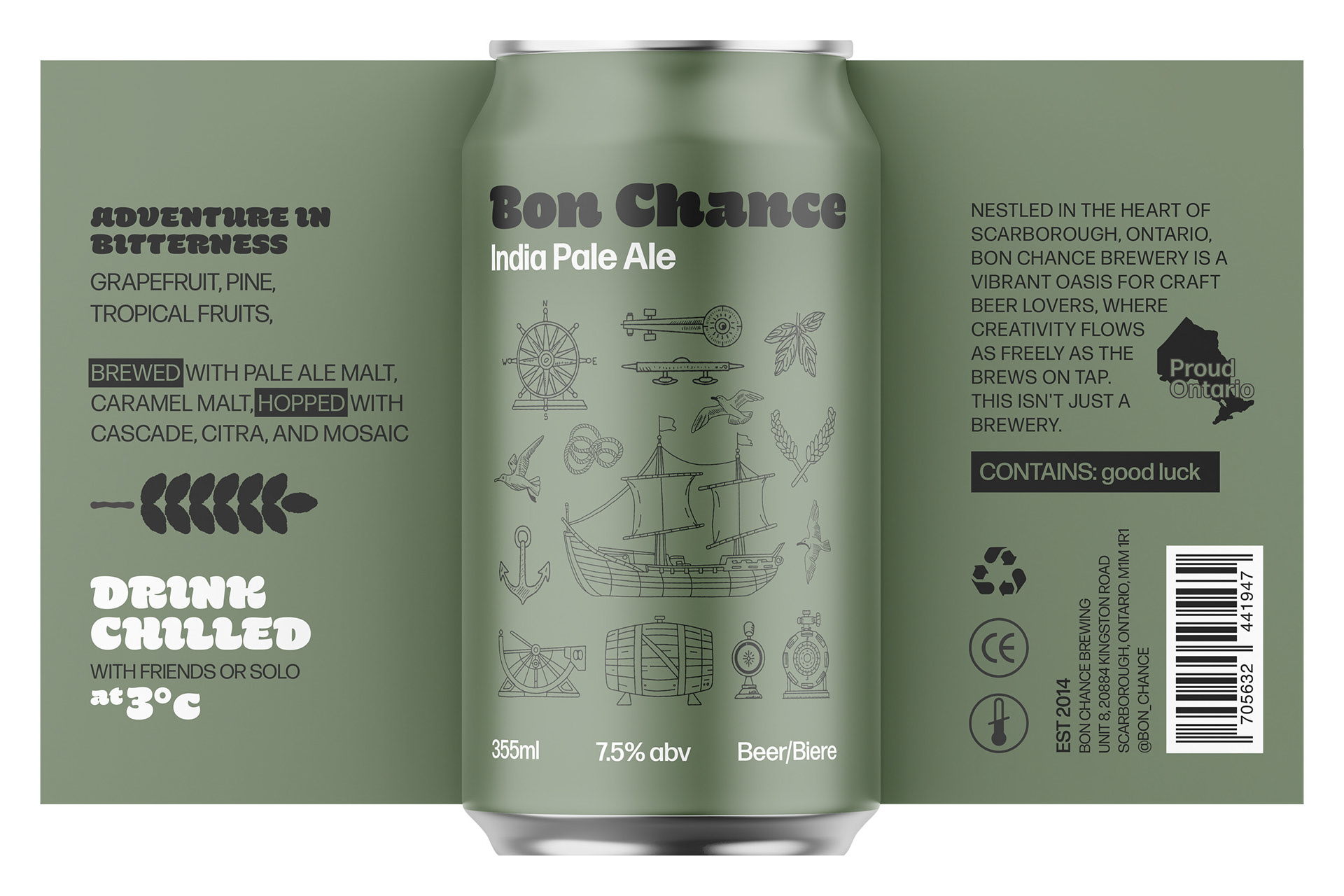
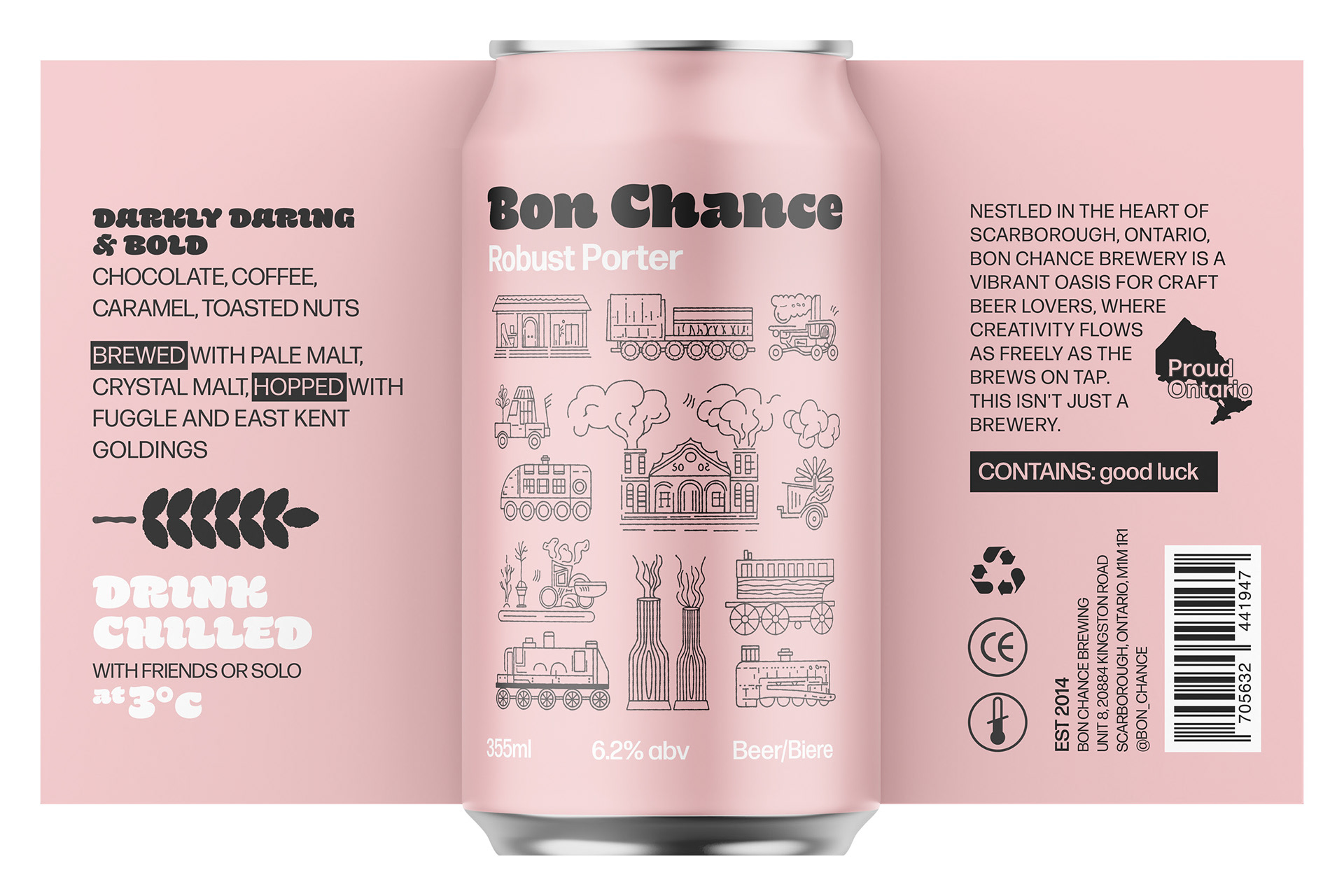
Each label features a unique color, thoughtfully chosen to represent the individual flavor and character of the beer inside, such as the refreshing quality of the Crisp Lager with its cool blue or the rich depth of the Robust Porter with its warm pink.
The rationale was to blend the contemporary with the classic, using a clean sans-serif typeface for modern appeal, while the detailed line illustrations give a nod to traditional craftsmanship and brewing heritage. The illustrations themselves tell a story relevant to the beer's profile—whether it's the nautical theme on the India Pale Ale suggesting it's history, adventure and exploration or the pastoral scenes on the Light Witbier hinting at richness and tradition.
The boxes reflect a continuation of the brand's playful and artisanal aesthetic seen on the cans. Each box is rendered in a vibrant, monochromatic scheme that matches one of their individual beer can colors, reinforcing brand recognition and creating visual impact.
Relevant collateral was created for the brand such as a vehicle wrap for their delivery trucks and a patio umbrella.
