Packaging, Branding, Social Media and Marketing
Programs used: Illustrator, InDesign, Photoshop
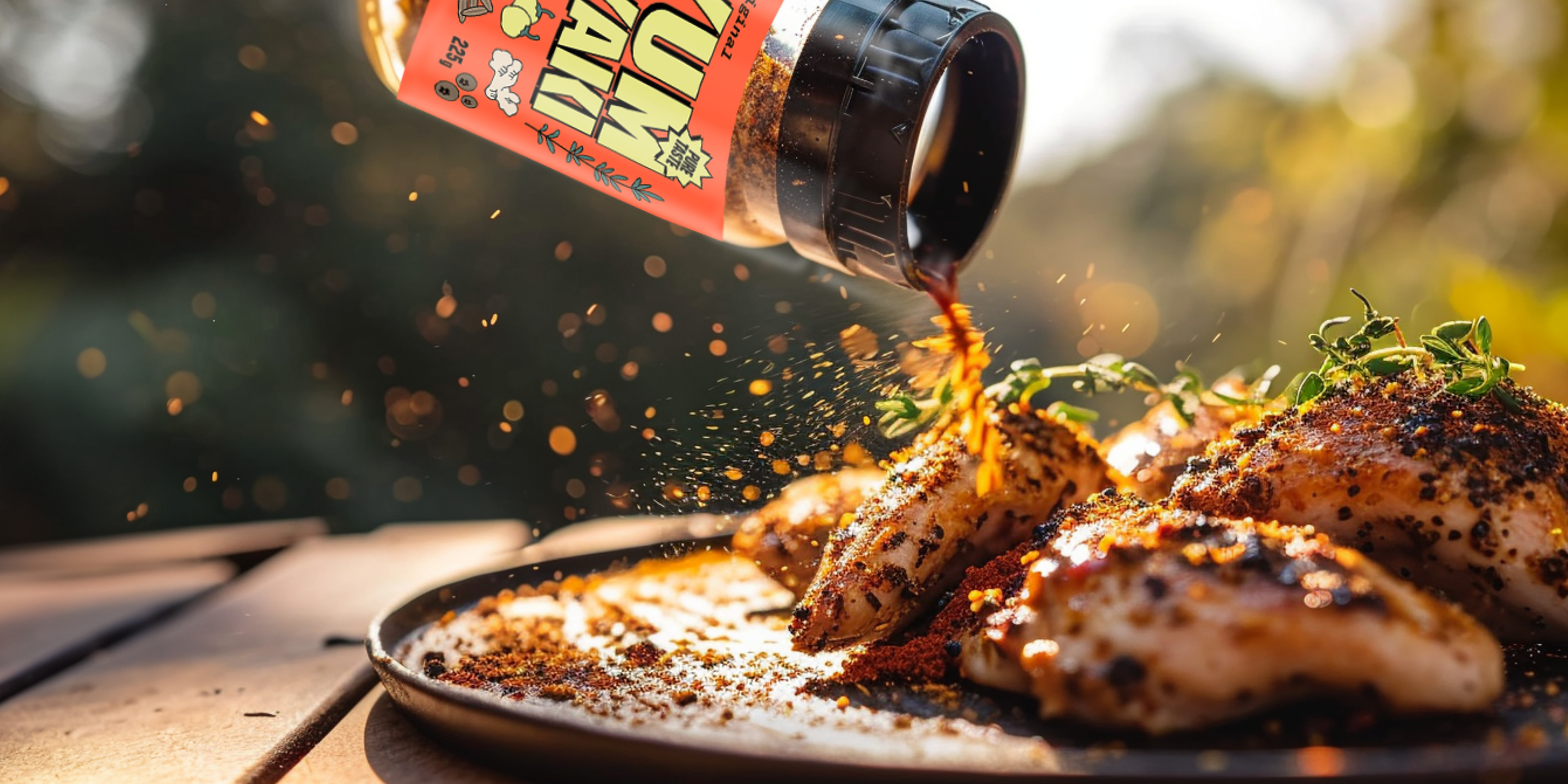
Goals & Constraints: The primary goal was to create a maximalist branding concept that embodies the essence of bold, flavor-packed spices. To achieve this, I incorporated vibrant and eye-catching colors to ensure that these small 225g spice jars truly stand out on store shelves. The overall direction will encapsulate the idea of elevating cooking experiences, encouraging customers to explore new culinary horizons. While striving for maximalist aesthetics, I aimed to strike a balance that conveys both the excitement of bold flavors and the premium quality of the spices. Additionally, to keep in mind the practical constraints of small packaging and the need for clear product information, as these factors are crucial for the project's success.


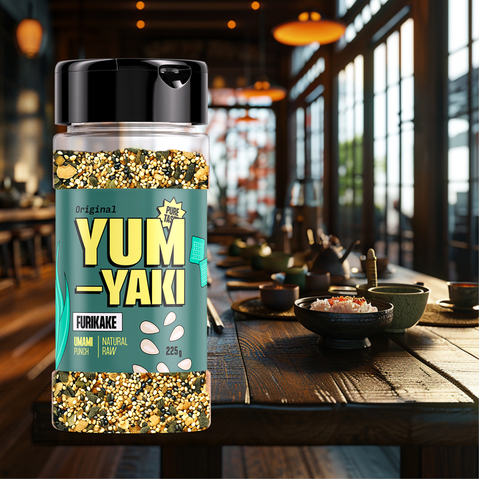
Furikake Flats: This spice blend has a short list of ingredients and given the small size of sesame seeds it was important to boost their size to create an eye catching and noticeable label.
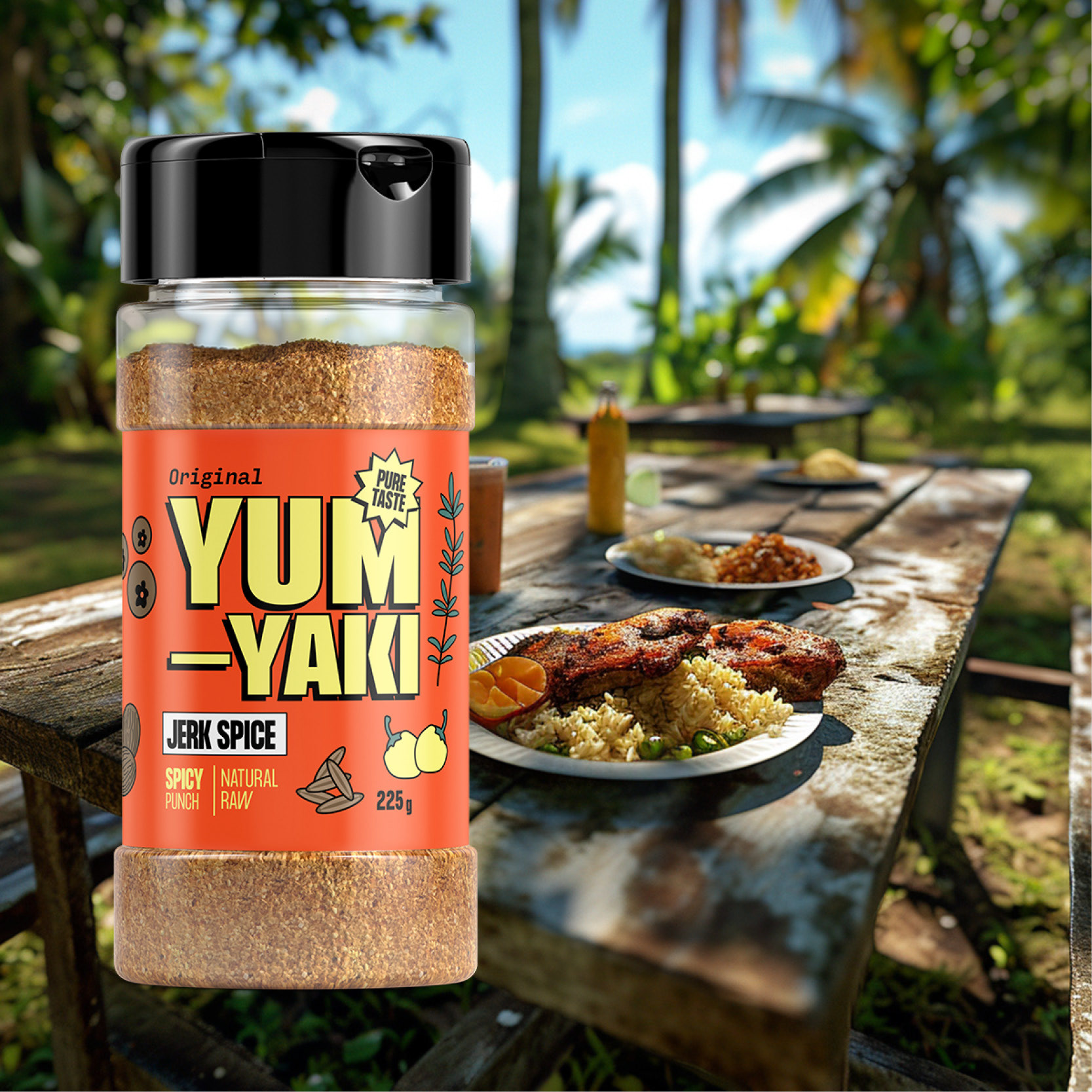
Jerk Spice Flats: Numerous ingredients contribute to the intricate flavor profile of this Jerk Spice. The selection of bold orange was deliberate, aligning with its spicy, tropical roots and as a bright complimt to the majority brown base ingredients that make up the final product. The incorporation of negative space, strategically employed within the limited label area, achieves a maximalist aesthetic without overwhelming customers.
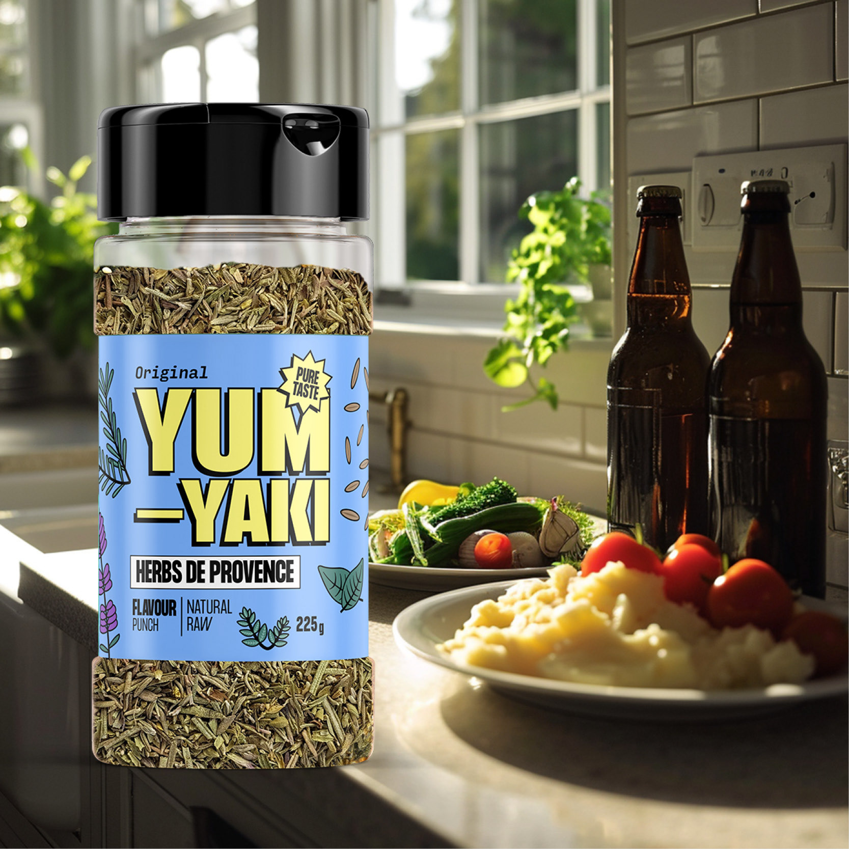
Herbs De Provence Flats: With its French origins in mind, I opted for a light blue hue to provide a vibrant contrast to the brand identity, in contrast to the darker green used for the furikake. This product boasts a rich medley of ingredients, with special attention given to showcasing the lush green leafy elements, positioning it as a wholesome and fresh offering. The typo from Herbes to Herbs is intentional, improving readability for English-speakers.
Sell Sheets: These US Letter two sided sell sheets contain all the key information required by distributors and sales reps. Contact information and pricing has been replaced. The design features a distinct hierarchy while maintaining an engaging appeal for sales representatives who encounter numerous sell sheets on a daily basis.
